Foundation
Logo
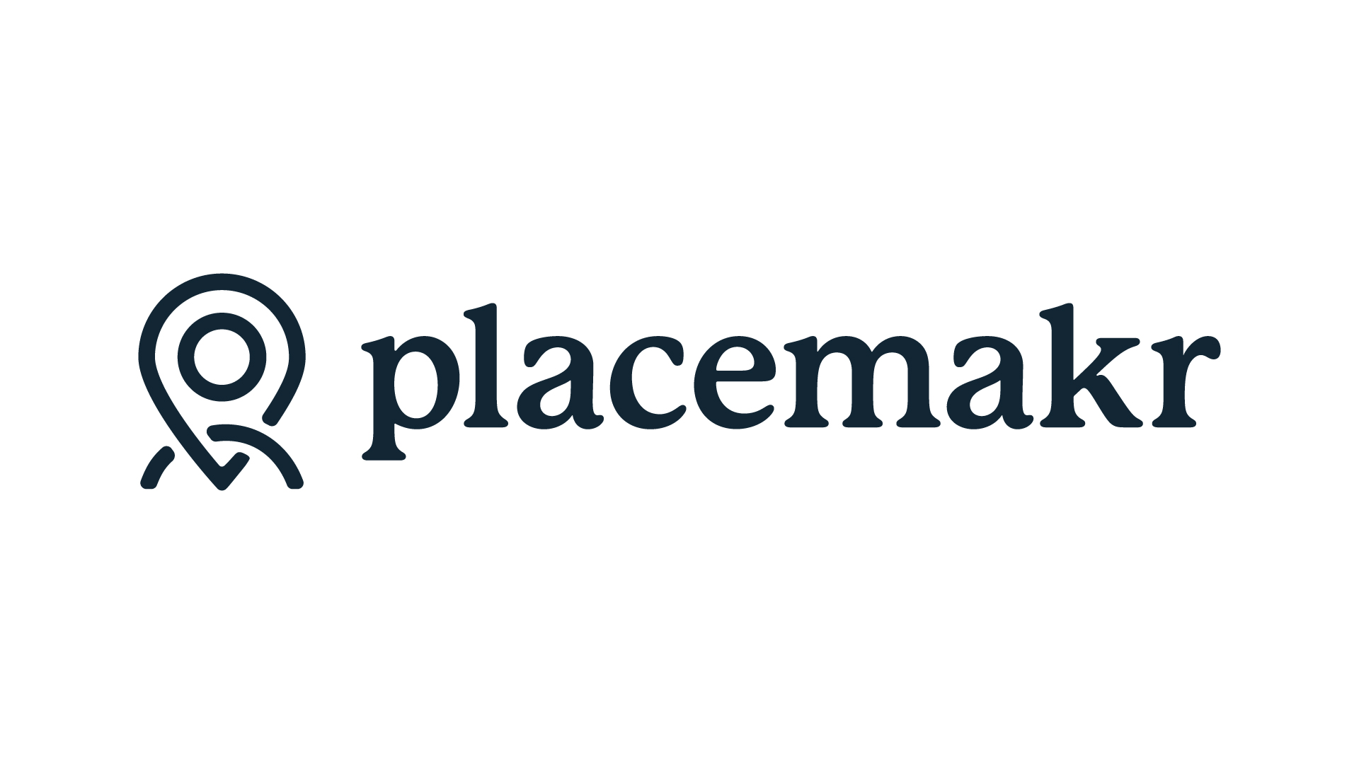
The Placemakr logo is the signature of the brand. It comes in three lockups — horizontal, vertical, and the logomark on its own — each in a set of brand colors. Choose the lockup that fits the space and the color that keeps the mark legible on its background.
Horizontal lockup
The wordmark and logomark side by side — the preferred default for headers and wide layouts. Use the Midnight mark on light backgrounds and the White mark on dark or brand-colored ones.
Vertical lockup
The logomark stacked above the wordmark — for square or narrow, centered contexts where the horizontal lockup would be too wide.

Logomark
The symbol on its own — for favicons, avatars, and small or square spaces where the full wordmark won’t read.



Clear space & minimum size
Give the logo room to breathe and never let it get too small to read.
- Keep clear space equal to the height of the logomark on all sides — no text, imagery, or edges inside it.
- Minimum size — 120px wide for the horizontal lockup, 24px for the logomark. Below that, switch to the logomark.
- Always scale proportionally — never stretch or condense.
Usage
Do
- Use the White mark on Midnight or Cabana backgrounds.
- Use the Midnight or Black mark on light backgrounds.
- Prefer the horizontal lockup as the default.
- Preserve the clear space and minimum size.
Don’t
- Recolor the logo outside the approved brand colors.
- Stretch, rotate, or add shadows and effects.
- Place a low-contrast mark on a busy or clashing background.
- Rebuild the lockup or change the spacing between elements.